


There's a new wave of developers looking to master web development, and like it or not some form of UI knowledge is always beneficial to make things look good on your application. These are some design issues that I had no idea could make a UI look drastically better.
Before we jump ahead let's have a look at this tweet, try figuring out what changed and what helped it look much better.
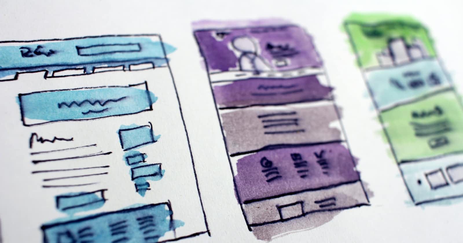
Setting a theme
Most websites have a set theme which is followed throughout their UI. It's important to understand from the tone of the colors to the structure of information being delivered throughout the interface. A theme has more to it than we initially understand, like typography and color science ex: shades of color that go with your primary color or using outlined icons to match the aesthetics of the overall interface and so on. But what's the main base of a theme?
The holy three: Alignment, Spacing and Sizes
It's safe to say that the theme you are setting depends on these three, or the theme sets them. Either way, these are supposed to be uniformly used throughout sections and elements so that we don't have a messy interface.
These three are connected in a way and are a big part of responsive design, you would want your sections and elements to align to their relevant positions while also maintaining a good amount of distance between each other. These two are easy to mess up with and can take a heck ton of time if not done right.
Make things easier by having a grid system to follow so that alignment isn't much of a work to deal with or it would become a redundant manual work which nobody likes. This again, depends on the theme you pick. So following a simpler structure for starters should be ideally a breeze to work with.
Here's an insider info, when structuring the UI for a blog try left aligning the content box rather than center aligning it. It's much easier to read it thus improving the user experience. I mean, even medium does it. Here's an article for reference, it also doubles as an informative blog on colors, spacing and hierarchy.
Rem and em are your best friends when defining the type-sizes of your elements. why not px? Using px values and making a responsive interface will be a nightmare as a 30px heading on laptop will look/have the same size on your mobile screens. I suggest having a look at this video for a more detailed explanation.
Line-height
Line heights make drastic changes. For a text heavy interface it's best to set a line height of 150%. What it does is that it relatively sets the value to the font-size of the element. Make sure to set a unit-less value and avoid setting it in a percentage as it may have a poor inheritance behavior. Here's a basic example below
After setting a line height value of 150% to the font-size of the paragraph.
Note: This works well for text heavy components/interfaces like a blog, not really ideal for all sorts of sections and headings etc. Read more about it over here. While setting a line-height it also depends on the x-height of the typeface as well, It's best to Identify the right value to suit your design.
Avoid orphan words on headings
This was a rather new revelation to me but it works just right. Take a look back at the tweet I have linked above, they too have adjusted the title to avoid singling out a word on the next line. It's all about symmetry, a symmetric pattern is more usable/pleasing to the eye than a "cool" asymmetric mess.
I hope this article helps you with finessing your UI. This article was possible thanks to Jyotsna Rane, Tanay Pratap and Pragun Dua. Feel free to comment down below your projects and I'll give my best to help you.